
QuickLaundry Get Support 24/7
Dashboard
This dashboard is designed to help you monitor and manage your platform activity in real-time.
Here’s what each part of the dashboard shows:
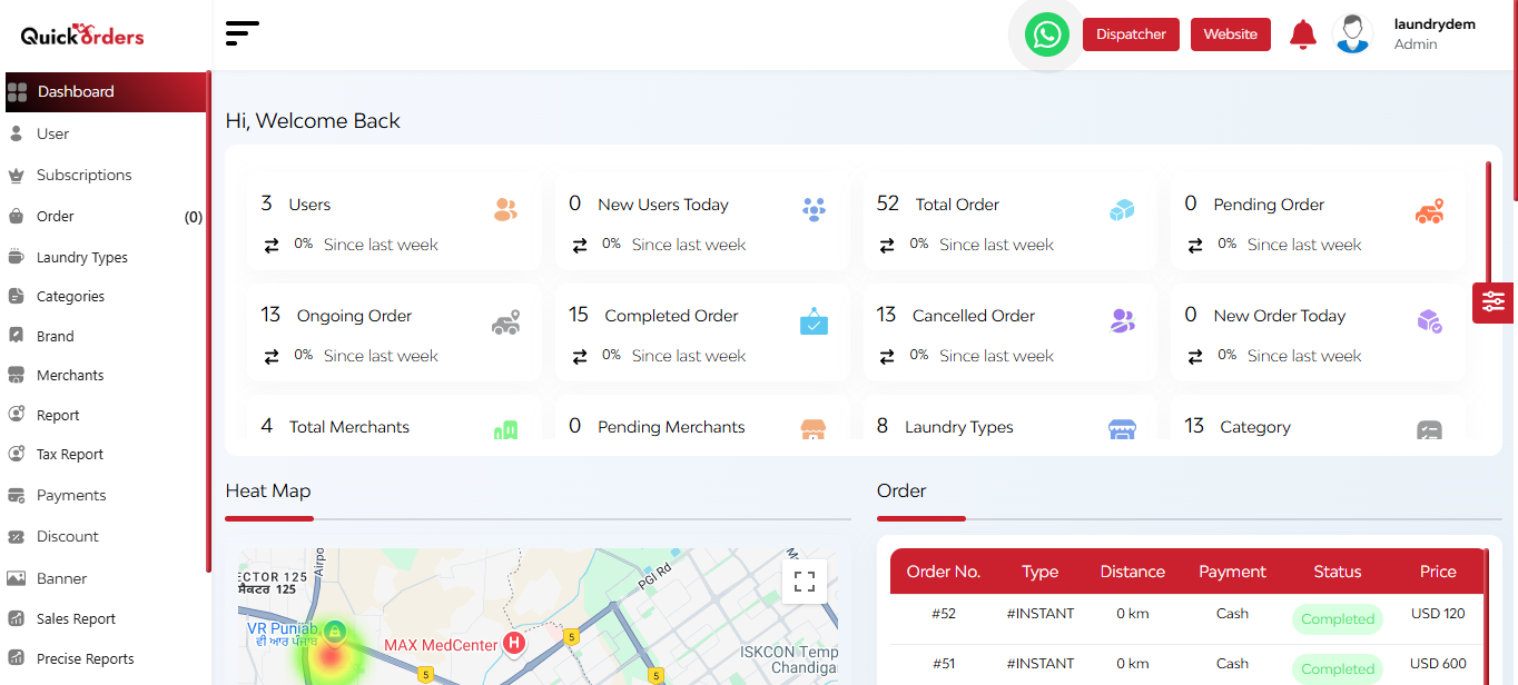
Upon successful login, the admin is presented with this dynamic admin dashboard.
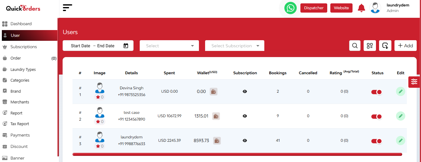
Navigation Sidebar: On the left side of the dashboard, a navigation sidebar provides easy access to various features and modules within the platform.
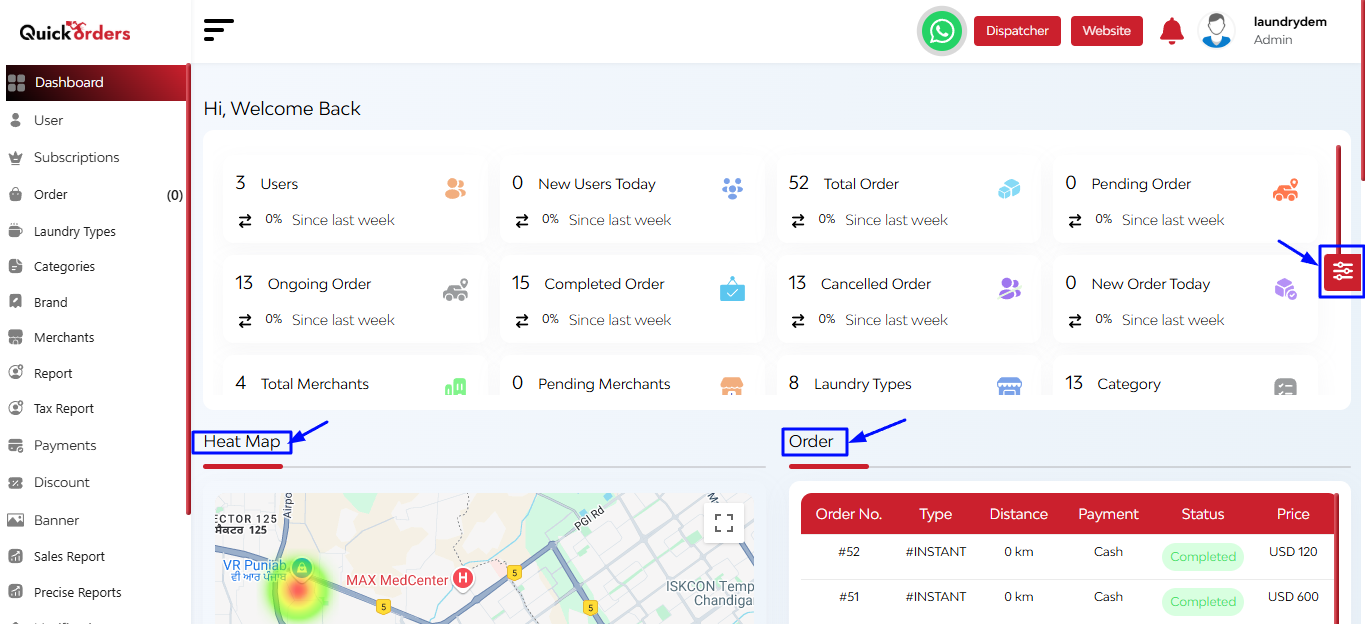
Theme Customization Widget: On the right side of the dashboard, a theme customization widget is available, allowing you to toggle between light and dark modes and customize the color scheme of the sidebar and top bar.
Interactive Feature Cards (Center of the Dashboard):
- Users: Total number of registered users.
- New Users Today: Displays the number of users who signed up today.
- Total Service Request: Displays the overall number of service requests raised.
- Pending Service Request: Total number of requests still awaiting action.
- Ongoing Service Request: Services that are currently in progress.
- Completed Service Request: Total number of services completed.
- Cancelled Service Request: Requests that were canceled before completion.
- New Service Request: Tracks how many new service requests came in today.
Clicking on a card navigates to detailed information about that metric.
Additionally, there is a Heat Map and Order Section, which provides a visual representation of booking hotspots.
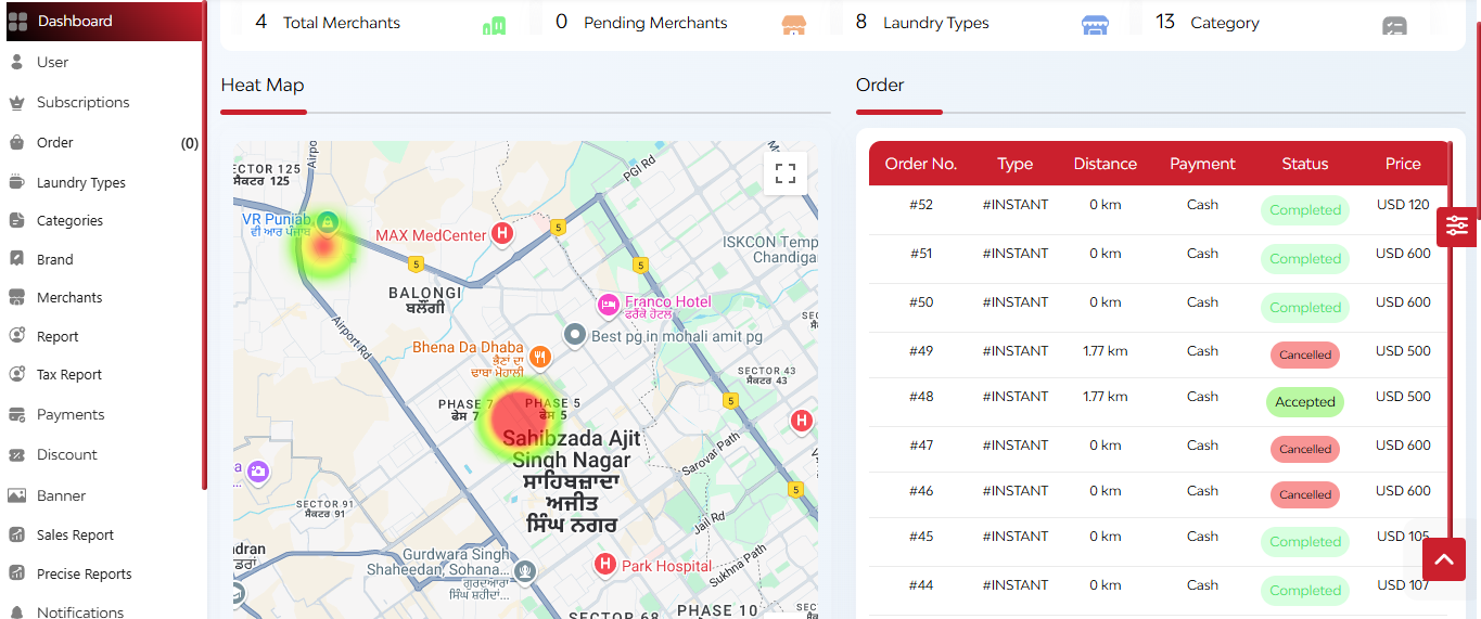
- Highlights areas with high user activity
- Indicates regions with the majority of bookings each month
- Quick view of orders based on order number, type, distance, payment, status, and price
Below that, you can see a pie chart and a bar graph.
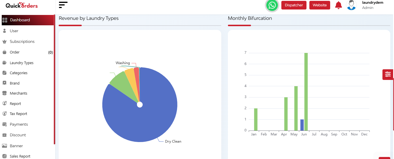
- Here you can see the revenue generated by various laundary types available and a bar graph which represents a monthly bifurcation on the basis of users and orders.
After that, you can see the graphs regarding the cash and online revenue.
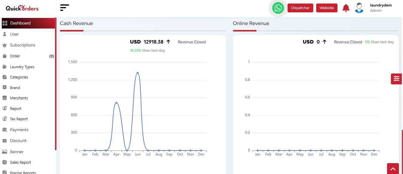
Here you can see the:
- Cash and online revenue trends over days and hours within a month
- Total income comparisons between the current and previous months