Chat with us, powered by LiveChat

Quickdelivery Knowledge Base Get Support 24/7

Dashboard

The dashboard provides a quick snapshot of your business performance. It’s designed to give you real-time data and easy navigation, so you can manage operations efficiently.

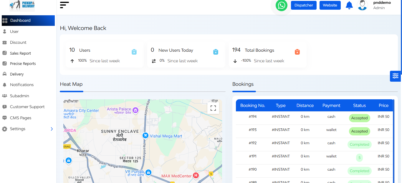
Upon successful login, the admin is presented with this dynamic admin dashboard.

On the left side of the dashboard, there is a Navigation Sidebar that provides easy access to various features and modules within the QuickRides platform.

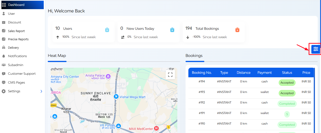
On the right side of the dashboard, there is a Theme Customization Widget where you can toggle between light and dark modes and customize the color scheme of the sidebar and top bar.

At the centre of the dashboard has Interactive Feature Cards that display

  • Total users
  • New customers today
  • Total bookings

Clicking on a card navigated to detailed information about that metric

Also there is a Heat Map Section i.e. a visual representation of booking hotspots.

  • Highlights areas with high user activity
  • Indicates regions with the majority of bookings each month.
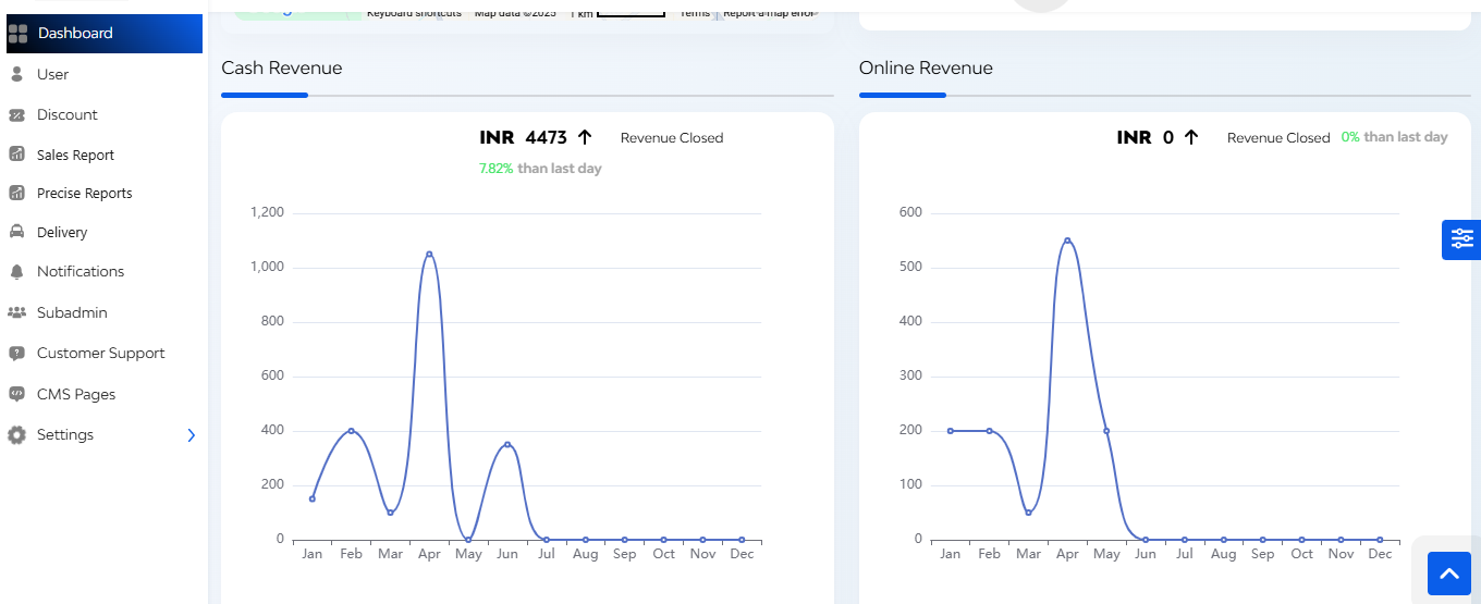
Revenue Graph

  • Cash and online revenue trends over days and hours within a month
  • Total income comparisons between the current and previous months

FAQ's

The dashboard provides a real-time snapshot of key platform metrics like total users, new sign-ups, bookings, and revenue. It helps admins quickly monitor overall performance and activity without navigating deep into individual modules.

Each card shows live data for:

  • Users – Total registered users on the platform
  • New Users Today – Count of users added on the current day
  • Total Bookings – Total number of bookings made on the platform

Clicking on any card redirects the admin to its detailed management section.

The heat map visually highlights geographic areas with the highest booking activity.
Admins can use this data for:

  • Regional strategy decisions
  • Planning promotional campaigns
  • Identifying high-demand zones

Currently, the heat map is a visual representation. While it doesn’t support filters or detailed reports directly from the map, admins can use its insights to explore related data in the bookings section.

It shows a list of the most recent bookings made on the platform, with the following details:

  • Booking ID
  • Booking Type (Instant or Scheduled)
  • Distance of delivery
  • Payment Mode (Cash, Wallet, Online)
  • Booking Status (Accepted, Rejected, Completed, Ongoing)
  • Total Price

This helps the admin stay updated with ongoing transactions.

Two revenue graphs are displayed:

  • Cash Revenue – Total revenue collected via cash payments
  • Online Revenue – Revenue received via online methods (wallet, UPI, cards, etc.)
    These graphs show performance trends month-wise to help with financial tracking and forecasting.

The current version is for real-time monitoring only. For detailed exports or reports, admins should refer to the Reports or Bookings section depending on what data is needed.

Yes, the dashboard fetches data dynamically, ensuring that counters, heat map, and recent bookings reflect the latest activity on the platform.

You’ll be redirected to the respective management module – like the bookings list or user management screen – where you can view, search, and filter detailed records.

The dashboard is primarily read-only for monitoring purposes. For actions such as editing bookings or managing users, admins need to go to the relevant management section through provided redirects.